• Typography
• Typography
• Typography
• Typography
• Typography
• Typography
• Typography
Heading 100
Heading 200
Heading 300
Heading 400
Heading 500
Heading 600
Heading 700
Heading 800
Heading
We use Poppins across our websites, app, social media accounts & Anything that is used to market our platform.
Learn More• colors
• colors
• colors
• colors
• colors
• colors
• colors
• colors
• colors
• colors
• colors
Highlight Color
45deg, #e90021 1%, #fd980f 99%

The highlight color, is used for the main CTA's or branded elements


The Secondary color, is used on containers directly on top of the <Body>
The Navigation color is self-explanatory. We use it for our Navigation
New
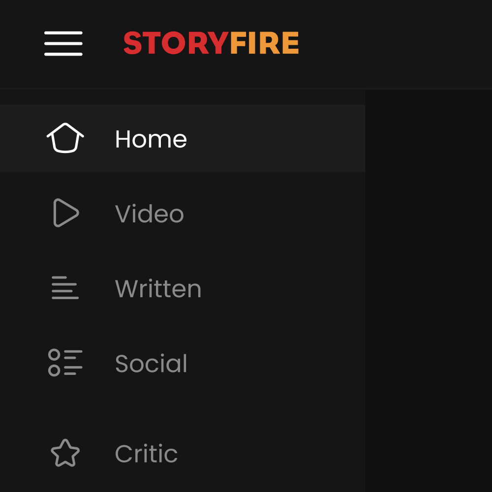
Written

New
Video

New
Social

Our dark color pallet gives all focus to the content & also gives the highlighted button more contrast, which allows them to grab the most attention
We moved from old and bland colors, to new & engaging ones
The forest background has been with us since the very beginning and it's not leaving anytime soon. It's new minimal design means we can use it in vector form, & make new forest designs with ease
Our FLAME!!!
Want to use our logos marks? Sure, check download it here & check out the best way to use it
Learn More
Design
Developers
Creator
Live
Marketplace
Awards
Suite
premium
store
admin
Creator Fund
plus
manager
analytics
music
editor
let's have
fun with
this...
opera House
palace
console
phone
watch
StoryFire products should all consistently reflect our vision, with the StoryFire brand identity. Products are accompanied by our logo and have the same design as they’re sibling products.
New and improved icons, all made using our icon grid. Consistent across both web & mobile platforms with no scaling issues.
Reactions is the new way to express how you feel about certain content on StoryFire without the need for words.


